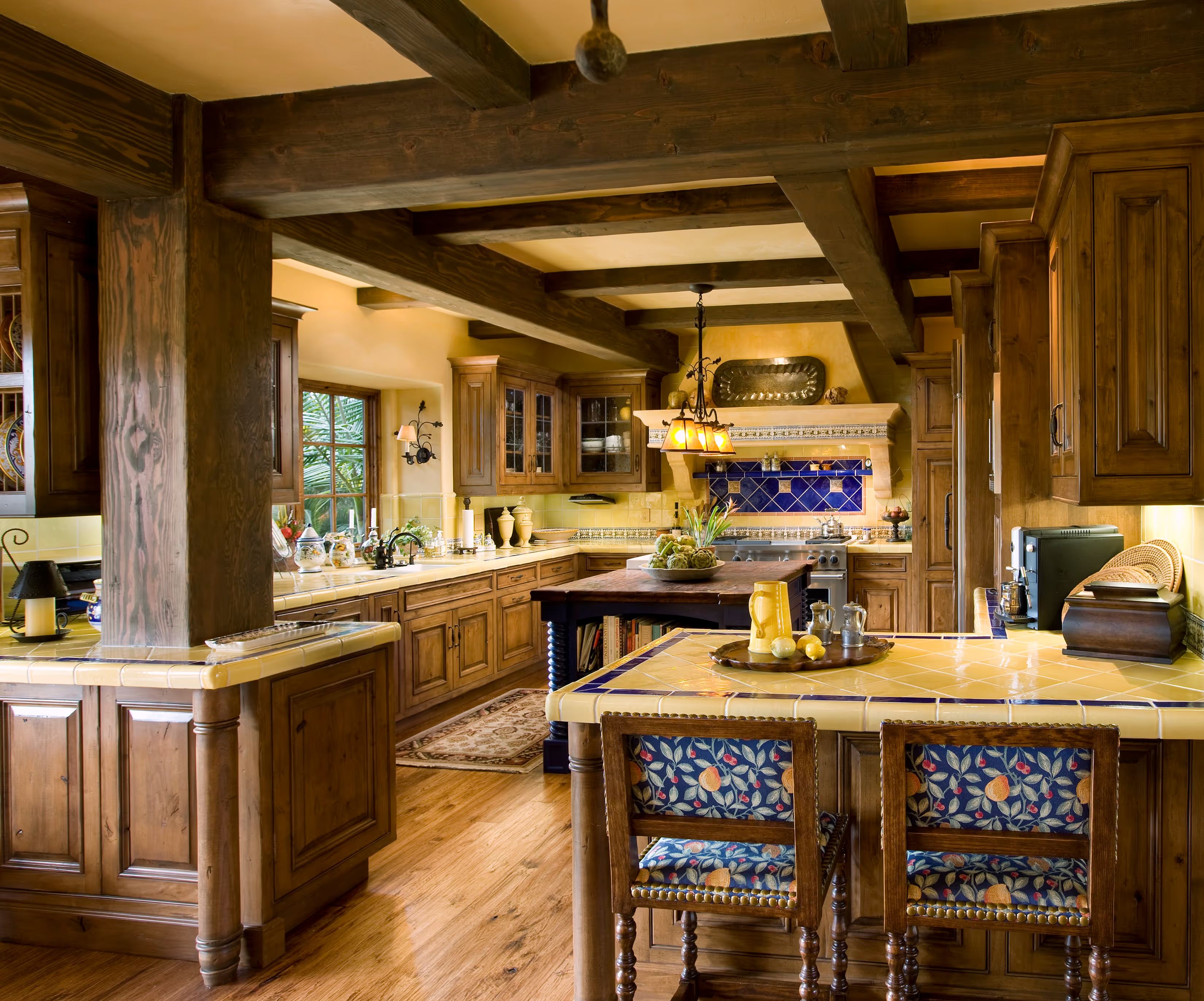

Color is an important piece of the interior design puzzle. I’m fascinated by color’s influence on the feel of a room. You’ve probably heard that red is invigorating, but most people don’t want a lot of red. Greens and blues soothe the nerves. Yellow is cheerful and inspires creativity, but, like red, can come across too strong. This is how color psychology for interior design comes into play.

Color choice comes down to personal preference and how colors affect people. I love red; it energizes me! I often ask clients their favorite colors and the colors that they hate. (If you can’t figure it, out go look in your closet.) With some clients, we’ve even done wonders with purple.
At the start of all my projects, I ask each client, “What is your favorite color?” “What is your least favorite color?” Both are equally important. This comes down to: “What colors do you use?” We start with that. Then, frequently there will be something that they show me - a piece of art or a travel memento. One time, clients brought in handcrafted ceramic dinnerware they loved. There’s usually some little piece that inspires their color scheme.
I delve deeply into color psychology for interior design. We each have psychological associations to color. These feelings typically stem from childhood environment and culture.

I’m not surprised by many of my clients’ aversion to red, but I am surprised that few people like green. Green permeates our natural world. I recommend that if you want the organic effects of green, you explore the variations.
A common mistake is to go too pure, too bright. Look at the paint swatches and go 2-3 shades darker or more grey. Going darker is always better than lighter because it tones down the room. Always paint samples on your walls. Lighting and color are two peas in a pod. A teal green can look blue during different times of day, depending on how the sun shines on it.

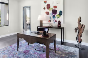
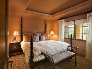
Color choice affects how we feel throughout the day. Color psychology for interior design proves that greens and blues promote concentration; they are good shades for an office. Calming, darker tones of blue and green make a bedroom feel like a cocoon. Generally, a darker color is more conducive to helping you sleep, and a brighter color for waking up.
Clients care about color. Subconsciously, color psychology for interior design influences our everyday lives. We always have opinions on color, whether for car or shirt. We are affected by colors and gravitate toward the ones we like and away from the ones we dislike.
Which colors are prevalent in your life? How do they enrich your soul?
Schedule your Discovery Call today to explore how we can bring your WELL Designed™ home to life.